|
maxhamner
Squire

USA
26 Posts |
 Posted - Nov 04 2004 : 11:11:29 AM Posted - Nov 04 2004 : 11:11:29 AM


|
Working on a project and thought I'd post this for feedback...
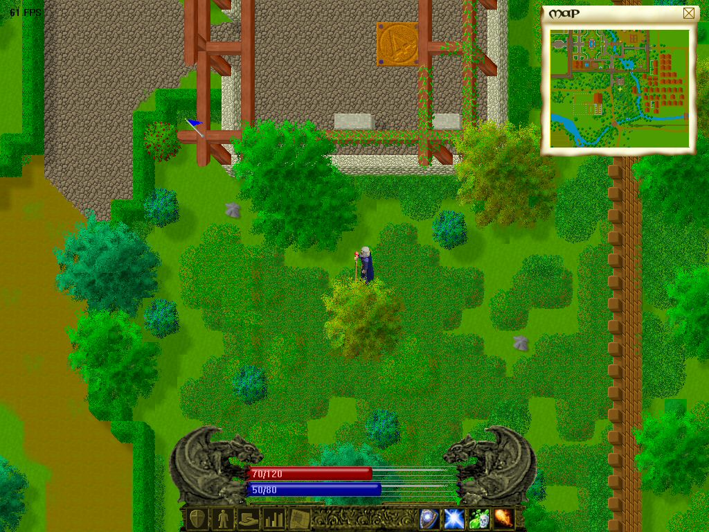
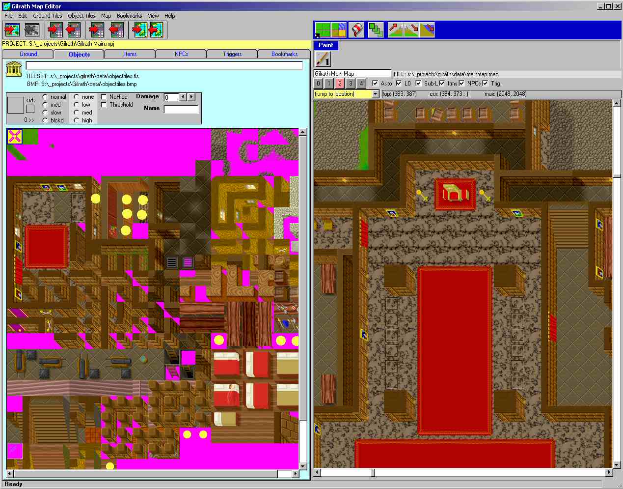
I'm writing a 2D tile based RPG in visual basic, using DX7. The shell of the engine is there, and the editor is comming along nicely (the editor will allow editing of map, items, npcs, coversations, triggers, etc.
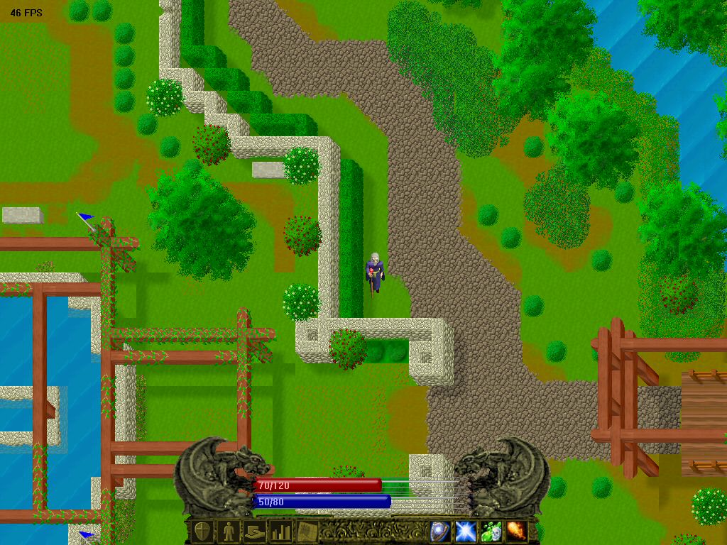
Although a 2d tile system, I have 5 layers of tiles, overlayed and offset (and of coruse smooth scrolling), to get a psuedo-isometric view. The games supports all common resolutions (640x480, 800x600, 1024x768, 1280x1024, and 1600x1200), allowing you to see a larger area of the map if you have the hardware to support it.
I'm currently getting about 60FPS at 1024x768 x 32biit on a P500 with an ATI RADEON 7500 (slows to about 40fps when there is a lot of water on the screen as all water tiles animate). I use an integer per tile - allowing for huge diversity in tiles, although I'm creating it around two sets of 2048 tiles (one for ground (level 0), one for buildings/trees/objects(level 1-4)), which does not include items. (yes, I'm using vblank on page flip). My roomates computer (1.7G? Radeon 9xxx?) gets about 110 FPS at 1024x768..
Here are a few screen shots (frame rate a little low, I have a zillion things open on the desktop and ran it from the IDE to grab these), your character passes 'under' things like trees and wood structures, but buildings (which are multi-floored) will hide the levels 'above' you so you can see yourself when inside.
Seems like decent performance to me, any comments?
Image Insert:

Image Insert:

Image Insert:

 |
--
max
There are 10 kinds of people in the world, those that understand binary and those that don't. |
|
|
VBBR
Moderator
   
Brazil
617 Posts |
 Posted - Nov 04 2004 : 11:38:04 AM Posted - Nov 04 2004 : 11:38:04 AM


|
Looking great to me! Keep up the good work. 
|
Whatever. Who knows... |
 |
|
|
timbo152k
Squire

Canada
25 Posts |
 Posted - Nov 04 2004 : 12:12:15 PM Posted - Nov 04 2004 : 12:12:15 PM


|
| This game looks awsome! Is it going to be single-player or multiplayer? Very nice work on the graphics - did you draw them yourself, or get them from a library? |
 |
|
|
Eric Coleman
Gladiator
   
USA
811 Posts |
 Posted - Nov 04 2004 : 12:18:27 PM Posted - Nov 04 2004 : 12:18:27 PM


|
Sweet! Keep up the good work.  |
 |
|
|
Zarneth
Knave
 
Australia
62 Posts |
 Posted - Nov 04 2004 : 12:24:51 PM Posted - Nov 04 2004 : 12:24:51 PM


|
| Wow. I have to admit even I'm slightly impressed. And that's really saying something. I'm assuming you made all (or at least most) of the gfx yourself? |
"VB is gay because it's simple, stylish, functional, and simply works as expected." |
 |
|
|
maxhamner
Squire

USA
26 Posts |
 Posted - Nov 04 2004 : 12:43:36 PM Posted - Nov 04 2004 : 12:43:36 PM


|
Wow! Quick responses!
All tile graphics are hand-drawn by me (no rendering, just PSP pixel editing) except the 'cobblestone' which was sized down and edited from a larger texture.
The player graphics start off as a rendered image from a guy in germany who makes them available free. Then I heavily edit them, both changing all the colors as well as details like the hands (his renders have 'open' hands instead of wrapped around objects).
The 4 'spell' icons at the bottom were taken from a site with free spell icons intended for EQ. Doubtful they'll be used unless I get specific artist permission, but was working on the code and wanted something quick.
I'm hoping to get some kind of 'test' demo up at some point to get frame rates back from other users (with various hardware and resolutions) as I'm most worried about it and if the rates I currently get seem reasonable...
Just for fun I pulled an image of the game running at 1600x1200 that shows a much larger area of the map... framerate sucks... will try to attach it so it doesn't autodownload in the post... (appears to have worked)
Thanks again for the great comments!
Download Attachment:  Image1600.jpg Image1600.jpg
206.12 KB |
--
max
There are 10 kinds of people in the world, those that understand binary and those that don't. |
 |
|
|
VBBR
Moderator
   
Brazil
617 Posts |
 Posted - Nov 04 2004 : 3:22:33 PM Posted - Nov 04 2004 : 3:22:33 PM


|
quote:
Originally posted by Eric Coleman
Keep up the good work. 
Hey, did I see someone post something, just a little, like this... like, 2 posts above?
...no, maybe it's just me. That's probably what you get from a sick PC which needs to reset itself 2-3 times a day so it's happy. (and that's just 2 ou 3 weeks after it had blown my XP partition; lucky I'm paranoid and have 98 and 2000 installed too... not to mention all the data I've lost... *sigh*...)
|
Whatever. Who knows... |
 |
|
|
Sion
Warrior
  
Denmark
138 Posts |
 Posted - Nov 04 2004 : 4:40:05 PM Posted - Nov 04 2004 : 4:40:05 PM


|
It's looking great! 
It's kind of a funny isometric perspective though, but if it works well then all power to you. Really looking forward to an interactive demo  |
Visit my personal blog at www.AndersNissen.com! |
 |
|
|
ballistik
Moderator
 
72 Posts |
 Posted - Nov 04 2004 : 5:35:51 PM Posted - Nov 04 2004 : 5:35:51 PM


|
Nice job! Look forward to giving it a play. 
P.S. The gargoyles look great! |
_____________________
..::||::.. |
 |
|
|
Zarneth
Knave
 
Australia
62 Posts |
 Posted - Nov 05 2004 : 04:02:07 AM Posted - Nov 05 2004 : 04:02:07 AM


|
quote:
P.S. The gargoyles look great!
Arn't they're a bit out of balance with the rest of the graphics though. Not that they're bad. But they just dont' fit in. YOu gotta keep all the grpahics the same style or it looks bad and unproffesionnal? |
"VB is gay because it's simple, stylish, functional, and simply works as expected." |
 |
|
|
maxhamner
Squire

USA
26 Posts |
 Posted - Nov 05 2004 : 07:04:11 AM Posted - Nov 05 2004 : 07:04:11 AM


|
The gargoyles are actually a very edited digital photo of a gargoyle I have sitting on my desk. :D
Interesting comment on the gargoyles "don't 'fit in"... have to agree to some degree...
While they are not exactly the same style, I did 'posterize' the image (basically dropping the number of variations across gradients) somewhat to make it closer to the style of the game than a photograph. I tried dropping the contrast ratio of the gargoyles (the most striking difference from the game content) but as they look more like the game content they seem less and less like an overlay and kind of 'disappear' into the game - and I didn't care for that much.
I am considering moving them to the left and right edge of the screen with the life/mana bars side by side down near the control bar. But since my game allows running at any resolution I would probably have to produce quite a few additonal image pieces to make it look right at any resolution (i.e. how they meet or don't meet in the middle)
Definately appreciate the input... |
--
max
There are 10 kinds of people in the world, those that understand binary and those that don't. |
 |
|
|
Almar
Moderator
  
Netherlands
192 Posts |
 Posted - Nov 05 2004 : 12:18:21 PM Posted - Nov 05 2004 : 12:18:21 PM


|
| Looks nice ;) |
 |
|
|
Zarneth
Knave
 
Australia
62 Posts |
 Posted - Nov 06 2004 : 1:01:12 PM Posted - Nov 06 2004 : 1:01:12 PM


|
quote:
I am considering moving them to the left and right edge of the screen with the life/mana bars side by side down near the control bar. But since my game allows running at any resolution I would probably have to produce quite a few additonal image pieces to make it look right at any resolution (i.e. how they meet or don't meet in the middle)
Adiditonal images for each resolution? Not nesseciarily. Have each gargoyle and mana bar on each corner. and the lower bar part just centers on the screen. It is a tad oddd scicking up into the center like that. |
"VB is gay because it's simple, stylish, functional, and simply works as expected." |
 |
|
|
Eric Coleman
Gladiator
   
USA
811 Posts |
 Posted - Nov 06 2004 : 1:26:16 PM Posted - Nov 06 2004 : 1:26:16 PM


|
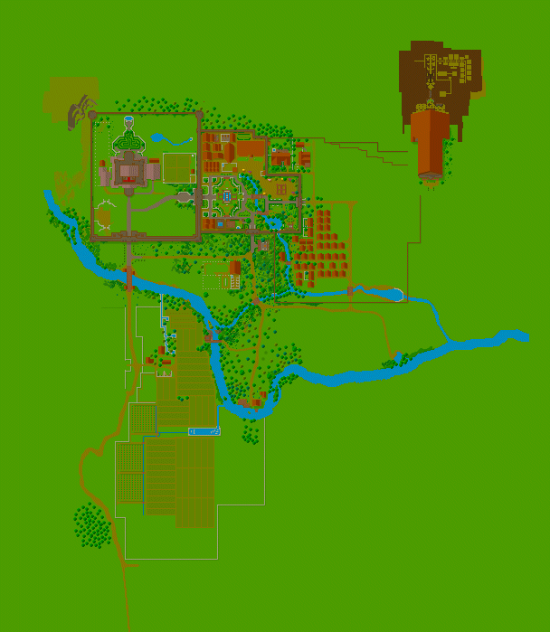
I think you did a really great job with the map in those screenshots. The river looks very natural in the mini map, as well as the placement of the trees. Overall it is probably not something that one would notice, but I've seen maps that look more geometric instead of having a natural "lived in" look to them.
Most typical RPG games have standard towns. 4 buildings with more people wandering around than the town has houses for. The layout of your town looks like it could be a real place, and I think that's really interesting.
|
 |
|
|
maxhamner
Squire

USA
26 Posts |
 Posted - Nov 06 2004 : 2:16:03 PM Posted - Nov 06 2004 : 2:16:03 PM


|
Wow, talk about picking up on a small detail - sharp eye!
This is the 'main' town for the game... the capital and probably the one that will be most visited - so it is large and has a lot of attention to detail for the 'lived in' look, even though it's not finished.
If all goes well each NPC will have a schedule with a home, a place to sleep, a place to work, etc so I had to provide proper 'housing'
My Map editor lets me view the world with a full screen view of the map, so I cut out the section that has currently been 'drawn' It's very clear where I stopped, some large buildings in town are too big (was playing around) and will have to go.
The cathedral (to be moved to another part of the map later) will be up against a mountain, but those layers are not drawn yet so the 'catacombs' that will stretch back into the mountain are visible here... (my map view automatically shows the topmost solid tile for each x,y coordinate - anything blank or > 50% transparent is treated as transparent)
The crop fields are smaller than is realistic in proportion to the town, but within reason (the 'clone paint' tool of my editor makes stuff like that a lot less laborious)
This image is 10% of the area of one map.

|
--
max
There are 10 kinds of people in the world, those that understand binary and those that don't. |
 |
|
|
maxhamner
Squire

USA
26 Posts |
 Posted - Nov 06 2004 : 2:24:04 PM Posted - Nov 06 2004 : 2:24:04 PM


|
Oh, on the gargoyles - I kinda agree about them being in the center - they do seem to always come up as one of my design issues...
But if I put them in the corners I run into issues at low resolutions (640x480) because stuff would overlap, and at 1600x1200 everything is too far apart. I am considering using the stretchblt functionality to scale the status area for the screen size, using one of two 'layouts' designed for 'smaller' and 'larger' resolutions... |
--
max
There are 10 kinds of people in the world, those that understand binary and those that don't. |
 |
|